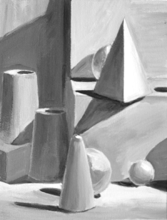
\The Elements: Line
A line is a mark made by a moving point and having psychological impact according
to its direction, weight, and the variations in its direction and weight. It
is an enormously useful and versatile graphic device that is made to function
in
both visual and verbal ways. It can act as as a symbolic
language, or it can communicate emotion through its character and direction

Line is not necessarily an artificial creation of the artist or designer; it
exists in
nature as a structural feature such as branches, or as surface
design, such as striping on a tiger or a seashell.

It can function
independently to suggest forms that can be recognized,
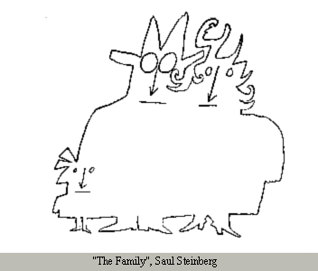
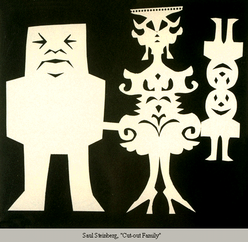
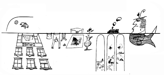
even when the lines are limited in extent. This can be seen in drawings such as the Saul Steinberg illustration shown here,
or in
Alexander Calder's minimal wire sculptures, which convey a great deal of
information about the figure with the most limited line.
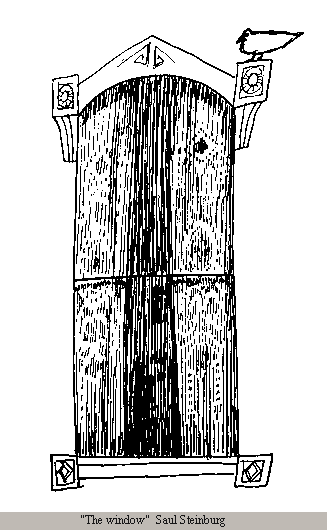
Lines can be
combined with other lines to create
textures and patterns.
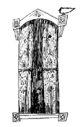
This is common in engravings and pen and ink drawings such as the one on
the right (click and enlarge to see linear detail). The use of line in
combination results in the development of
form and
value, which
are other elements of design.
However, line is not always explicit. It can exist
by implication, as the
edge of forms. As young children we usually begin drawing landscapes by making
outlines for earth, sky, and other objects. Gradually we learn that objects do
not have such outlines and we let color changes define the edges of shapes, creating implicit lines.
Thus we can speak of a horizon "line," or the "lines" of a car or a fashion
silhouette, even though we know there is no literal line present. For additional visual examples of
Expressive Qualities of Line
Certain arrangements of line are commonly understood to carry certain kinds of information.
For example,
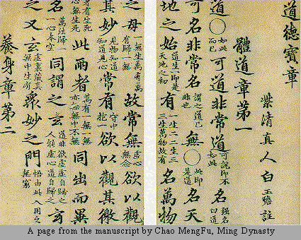
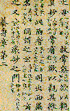
calligraphy is recognizable as a representation of
words, even when we do not know the language. Calligraphic imagery is often
used by modern artists simply because of the mysterious messages implied in the
"code" of unknown language.
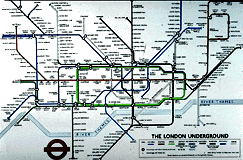
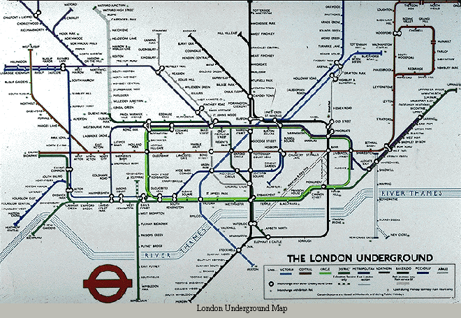
Line in the form of
maps is readily recognized as a symbolic
representation of a place. The place may be a local neighborhood, or the entire
world. It may be a carefully measured representation, or a stylized diagram,
such as a subway map. In either case, we understand it to be a device by which
we can understand the relationship between places; how to get from "here" to
"there."
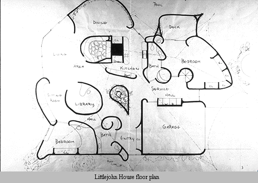
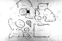 Floor plans
 are a specialized kind of map, a commonly
understood device which describes a building. This linear language can
be understood even when the building is as unusual as this one, which
was to be constructed of a sprayed foam material in a decidedly
unconventional form.
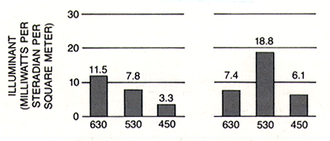
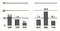 Graphs
 are another readily recognizable linear device. They are widely
used to communicate quantitative information and relationships in a visual way.
From the time we first meet them in basic algebra, to the last time we picked
up a copy of
USA Today, we encounter and interpret graphs.
Line also communicates emotion and states of mind through its character and
direction. The variations of meaning generally relate to our bodily
experience of line and direction.
 Horizontal
 line suggests a feeling of rest or repose.
Objects parallel to
the earth are at rest in relation to gravity. Therefore compositions in
which
horizontal lines dominate tend to be quiet and restful in feeling. One
of the hallmarks of Frank Lloyd Wright's architectural style is its use
of strong horizontal elements which stress the relationship of the
structure to the land.
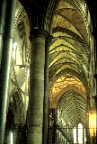 Vertical
 lines communicate a feeling of loftiness and spirituality.
Erect lines seem to extend upwards beyond human reach, toward the sky. They
often dominate public architecture, from cathedrals to corporate headquarters.
Extended perpendicular lines suggest an overpowering grandeur, beyond ordinary
human measure.
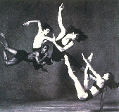 Diagonal lines
 suggest a feeling of movement or
direction. Since objects in a diagonal position are unstable in relation
to gravity, being neither
vertical nor horizontal, they are either about to fall, or are already
in
motion, as is certainly the case for this group of dancers. In a two
dimensional composition diagonal lines are also used to indicate depth,
an illusion of perspective that pulls the viewer into the
picture-creating an illusion of a space that one could move about
within. Thus if a feeling of movement or speed
is desired, or a feeling of activity, diagonal lines can be used.
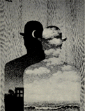
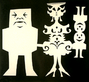 Horizontal and vertical lines in combination
 communicate
stability and
solidity. Rectilinear forms stay put in relation to gravity, and are not
likely
to tip over. This stability suggests permanence, reliability and safety.
In the case of the man in this family group, the lines seem to imply
stability to the point of stodginess.
Deep, acute curves, on the other hand, suggest
confusion, turbulence, even frenzy, as in the violence of waves in a
storm, the chaos of a
tangled thread, or the turmoil of lines suggested by the forms of a
crowd. The complicated curves used to form the mother in the family
group shown above suggest a fussy, frivolous personality.
 Curved lines
 do vary in meaning, however.
Soft, shallow curves
suggest comfort, safety, familiarity, relaxation. They recall the
curves of the human body, and therefore have a pleasing, sensual
quality.
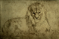
The
quality of the line is in itself a fundamental visual language,
to an extent that cannot be claimed for any other single element. Its use is
so universal that we are all profoundly sensitive to it. Even without an artist's
training, we can extract considerable meaning from the kind of line used in
a drawing. It is possible to recognize the soft, irregular lines of a quick
sketch from life, as seen in this study of a lion.
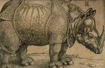
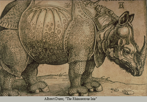
On the other hand, the crisp, carefully placed lines of the rhinocerous
are typical of a more studied, scrupulously worked studio drawing. The
lines suggest that this was not drawn from life, but from hearsay. This
is also evident from the fact that Durer drew this rather inaccurate
image in fifteenth century Europe when he could only have known of this
African animal from travellers' tales.
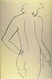
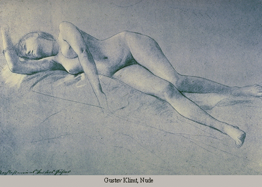
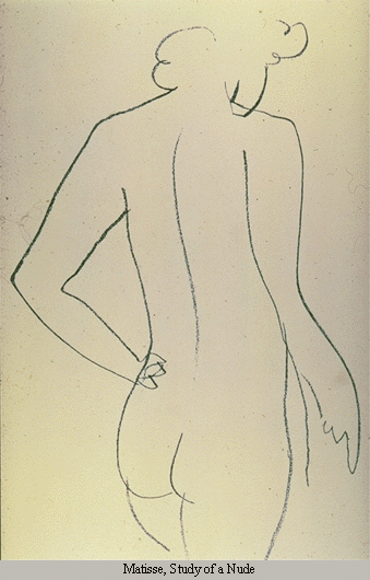
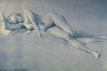
The quality of line in itself contributes to the mood of the work, and
for the master artist, the quality of line is a fundamental
expression of his/her style. This drawing of a nude by Matisse
demonstrates his ability to create his image through a minimal
number of expertly placed lines-lines that by their placement and
movement on the page identify this work with this artist as
surely as a signature.
For additional examples of how line works in design, follow this link.