Value:
-->
· 1. Value is a range from highlight (the
brightest highlight being white) to shadow (the darkest being black) and all of
the tones in between. The 3tones to know are white (highlight) middle grey, and
black (shadow).
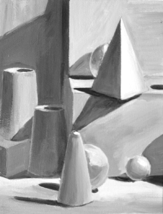
· 2. The aim of realist value drawing is
to show the light and shadow and surface tones, creating a three-dimensional illusion.
· 3. We can use value to make a 2D
drawing look 3D.For example, we can make this circle look like a sphere by
using a range of value to give the illusion of form.
· 4. Outlines only define visible edges
and don’t tell us anything about light and dark. Linear drawing and value
drawing are two different systems of representation.
· 5. One of these drawings has been made
using both outline and value, the other only uses value to describe a cube. By
eliminating outlines and using value to describe the differences in the surface
of an object a drawing becomes more realistic.
· 6. A good way to begin using value in a
drawing is to assign each shape in the drawing a different value. Notice the different
shapes of value in this ink wash drawing.
· 7. Define only by light and dark, not
by outline. Most successful value drawings use light and dark through out the
entire composition.
· 8. Value drawing is like painting in
graphite or charcoal. The process is different than using a brush – you need to
think in terms of AREAS as opposed to lines. Shade the darks, observing the
shape and value while being careful to shade up to the edge of adjoining light
areas. The realism seen in some images takes a very high degree of detail, where
the tonal values are closely observed and finely drawn.
· 9. When creating a value drawing, you
need to shift out of line-drawing mode. The best way to do this is to forbid
yourself to draw a line, and focus on areas of value. You may use the lightest
of lines to get down the basic shapes. From there, build up the shading. Often
the outline will be at the join between two different values, and is created by
the contrast between the light and dark area.
· 10. Contrast! Remember the lines between
values? Well, those hard lines form contrast. High contrast is when subjects
are illuminated by a bright light source and cast dark shadows. Light and dark values
will be next to each other. In the value chart, you would be skipping a value
or two (or more!).
· 11. Low contrast uses values that are
next to each other on the value chart. With low contrast, values close together
will define the bulk of the subject. You could selectively highlight or
accentuate portions with lights or darks.


No comments:
Post a Comment