Thursday, October 24, 2013

“COMPOSITION/STRUCTURE”

“COMPOSITION/STRUCTURE”
Composition--  Organization or arrangement of forms in a visual space.  Forms are arranged in particular ways to direct the viewer’s attention and to give an image the illusion of motion or stability.
Types of Compositions:
            --Stable (basically inactive):


 --Active (basically unstable):


                                       Collapsing Grid                                        

2D Fundamentals


Composition—Organization or arrangement of forms in a space.

Subject--In the representational arts, that which is represented, as distinguished by the author usually.

Focal point--In any composition, representational or abstract, a dominant area of major interest upon which the eye focuses more frequently.

Plane--A flat surface.

Picture plane--The surface upon which an image is painted, drawn, printed, etc.

Ground plane--In a picture, the surface apparently receding into the picture space, upon which people and objects seem to stand.

Picture space--The space that appears to extend back beyond a picture plane, although only illusionistic.  Picture space is usually divided into “Foreground”, “Middleground”, and “Background” along the ground plane.

Perspective--The representation, on a 2-Dimensional surface, of 3-Dimensional objects in space.  Sometimes, but not always, in reference to a single vanishing point and converging lines.

Foreshortening—A method of representing objects or parts of objects as if they were seen at an angle and receding into space instead of being seen in a strictly frontal or profile view.
                 
             
   profile                                                                foreshortened

Medium--The physical material with which an artist works.

Modeling--In 2-Dimensional mediums it is the suggestion of 3-Dimensionality through mark-making.

Shading—In painting, drawing, etc. the darkening of parts of an image to suggest play of light and shadow.  Shading is a type of modeling.

Volume--Any 3-Dimensional quality which is bound or enclosed, whether a solid or a void.

“Thumbnail” sketch—A small, crude preparatory sketch used to help with arrangement of objects in a composition.

elements and principles of design

Thanks Wikipedia!


Line

A line is a fundamental mark or stroke used in drawing in which the length is longer than the width. Two connected points form a line and every line has a length, width, and direction if it is straight .[3]
This image contains contour lines (the outline of the birds) and decoration lines (hatching).
Uses
  • A line that defines or bounds an edge, but not always the outside edge, could represent a fold or color change.[3]
  • A line that defines the edge of space can also be created by a gap of negative space. Many uses include to separate columns, rows of type, or to show a change in document type.[3]
  • Lines are used in linear shapes and patterns to decorate many different substrates, and can be used to create shadows representing tonal value, called hatching.[3]

Color

Color can play a large role in the elements of design[4] with the color wheel being used as a tool, and color theory providing a body of practical guidance to color mixing and the visual impacts of specific color combination.
Color star containing primary, secondary, and tertiary colors.
Uses
  • Color can aid organization so develop a color strategy and stay consistent with those colors.[4]
  • It can give emphasis to create a hierarchy

Attributes

Shape

A shape is defined as an area that stands out from the space next to or around it due to a defined or implied boundary, or because of differences of value, color, or texture.[5] All objects are composed of shapes and all other 'Elements of Design' are shapes in some way.[3]

Categories

  • Mechanical Shapes or Geometric Shapes are the shapes that can be drawn using a ruler or compass. Mechanical shapes, whether simple or complex, produce a feeling of control or order.[3]
  • Organic Shapes are freehand drawn shapes that are complex and normally found in nature. Organic shapes produce a natural feel.[3]

Texture

The tree's visual texture is represented here in this image.
Meaning the way a surface feels or is perceived to feel. Texture can be added to attract or repel interest to an element, depending on the pleasantness of the texture.[3]
Types of texture
  • Tactile texture is the actual three-dimension feel of a surface that can be touched. Painter can use impasto to build peaks and create texture.[3]
  • Visual texture is the illusion of the surfaces peaks and valleys, like the tree pictured. Any texture shown in a photo is a visual texture, meaning the paper is smooth no matter how rough the image perceives it to be.[3]
Most textures have a natural feel but still seem to repeat a motif in some way. Regularly repeating a motif will result in a texture appearing as a pattern.[3]

Space

In design, space is concerned with the area deep within the moment of designated design, the design will take place on. For a two-dimensional design space concerns creating the illusion of a third dimension on a flat surface:[3]
  • Overlap is the effect where objects appear to be on top of each other. This illusion makes the top element look closer to the observer. There is no way to determine the depth of the space, only the order of closeness.
  • Shading adds gradation marks to make an object of a two-dimensional surface seem three-dimensional.
  • Highlight, Transitional Light, Core of the Shadow, Reflected Light, and Cast Shadow give an object a three-dimensional look.[3]
  • Linear Perspective is the concept relating to how an object seems smaller the farther away it gets.
  • Atmospheric Perspective is based on how air acts as a filter to change the appearance of distance objects.
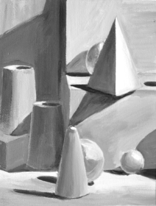
Form

Form is any three dimensional object. Form can be measured, from top to bottom (height), side to side (width), and from back to front (depth). Form is also defined by light and dark. There are two types of form, geometric (man-made) and natural (organic form). Form may be created by the combining of two or more shapes. It may be enhanced by tone, texture and color. It can be illustrated or constructed.

Principles of design

Principles applied to the elements of design that bring them together into one design. How one applies these principles determines how successful a design may be.[2]

Unity/Harmony

According to Alex White, author of The Elements of Graphic Design, to achieve visual unity is a main goal of graphic design. When all elements are in agreement, a design is considered unified. No individual part is viewed as more important than the whole design. A good balance between unity and variety must be established to avoid a chaotic or a lifeless design.[4]

Methods

  • Proximity
  • Similarity
  • Continuation
  • Repetition
  • Rhythm is achieved when recurring position, size, color, and use of a graphic element has a focal point interruption.
  • Altering the basic theme achieves unity and helps keep interest.

Balance

It is a state of equalized tension and equilibrium, which may not always be calm.[4]

Types

The top image has symmetrical balance and the bottom image has asymmetrical balance
  • Symmetry
  • Asymmetrical produces an informal balance that is attention attracting and dynamic.
  • Radial balance is arranged around a central element. The elements placed in a radial balance seem to 'radiate' out from a central point in a circular fashion.
  • Overall is a mosaic form of balance which normally arises from too many elements being put on a page. Due to the lack of hierarchy and contrast, this form of balance can look noisy.

Hierarchy

A good design contains elements that lead the reader through each element in order of its significance. The type and images should be expressed starting from most important to the least.[4]

Scale/proportion

Using the relative size of elements against each other can attract attention to a focal point. When elements are designed larger than life, scale is being used to show drama.[4]

Dominance/emphasis

Dominance is created by contrasting size, positioning, color, style, or shape. The focal point should dominate the design with scale and contrast without sacrificing the unity of the whole.[4]

Similarity and contrast

Planning a consistent and similar design is an important aspect of a designers work to make their focal point visible. Too much similarity is boring but without similarity important elements will not exist and an image without contrast is uneventful so the key is to find the balance between similarity and contrast.[4]

Similar environment

There are several ways to develop a similar environment:[4]
  • Build a unique internal organization structure.
  • Manipulate shapes of images and text to correlate together.
  • Express continuity from page to page in publications. Items to watch include headers, themes, borders, and spaces.
  • Develop a style manual and stick with the format.

The Vocabulary of Art


The Vocabulary of Art


  1. abstract- dealing with ideas rather than concrete existence
  2. aesthetic- concerned with beauty or the appreciation of beauty
  3. content- the things that are held or included in something
  4. design- a framework or scheme of pictorial construction
  5. form- the organization of the visual elements
  6. media, mediums- the materials and tools used by the artist
  7. realism- the quality or fact of representing a person, thing, or situation accurately or in a way that is true to life, including meanings that lie underneath the surface of the forms
  8. representation- a manner of expression in which the subject matter is presented through the visual elements so that the observer is reminded of actual forms
  9. style- the specific manner of doing something
  10. subject- a person or thing that is being discussed, described or dealt with
  11. technique- the manner and skill which media/mediums are used by an artist

Sunday, September 8, 2013

value


Value:
-->

·  1. Value is a range from highlight (the brightest highlight being white) to shadow (the darkest being black) and all of the tones in between. The 3tones to know are white (highlight) middle grey, and black (shadow).
·  2. The aim of realist value drawing is to show the light and shadow and surface tones, creating a three-dimensional illusion.
·  3. We can use value to make a 2D drawing look 3D.For example, we can make this circle look like a sphere by using a range of value to give the illusion of form.
·  4. Outlines only define visible edges and don’t tell us anything about light and dark. Linear drawing and value drawing are two different systems of representation.
·  5. One of these drawings has been made using both outline and value, the other only uses value to describe a cube. By eliminating outlines and using value to describe the differences in the surface of an object a drawing becomes more realistic.
·  6. A good way to begin using value in a drawing is to assign each shape in the drawing a different value. Notice the different shapes of value in this ink wash drawing.
·  7. Define only by light and dark, not by outline. Most successful value drawings use light and dark through out the entire composition.
·  8. Value drawing is like painting in graphite or charcoal. The process is different than using a brush – you need to think in terms of AREAS as opposed to lines. Shade the darks, observing the shape and value while being careful to shade up to the edge of adjoining light areas. The realism seen in some images takes a very high degree of detail, where the tonal values are closely observed and finely drawn.
·  9. When creating a value drawing, you need to shift out of line-drawing mode. The best way to do this is to forbid yourself to draw a line, and focus on areas of value. You may use the lightest of lines to get down the basic shapes. From there, build up the shading. Often the outline will be at the join between two different values, and is created by the contrast between the light and dark area.
·  10. Contrast! Remember the lines between values? Well, those hard lines form contrast. High contrast is when subjects are illuminated by a bright light source and cast dark shadows. Light and dark values will be next to each other. In the value chart, you would be skipping a value or two (or more!).
·  11. Low contrast uses values that are next to each other on the value chart. With low contrast, values close together will define the bulk of the subject. You could selectively highlight or accentuate portions with lights or darks.


perspective

1 Point Perspective

2 Point Perspective


3 point perspective

3 point perspective


  1. First, set 2 vanishing points on the left and right sides of your drawing surface. Make sure to set them wide enough apart so that you will have room for whatever you are going to put in front of the horizon.


    Draw 3 point perspective
  2. Next, imagine a line (or draw one) connecting the first two vanishing points; this is your horizon line. Place a third vanishing point somewhere between the first two, but well below the horizon line.
    The closer together you place these points, the more extreme the “fish-eye lens” effect will be. The further apart the points are, the less effect you'll see from perspective.

    Draw 3 point perspective

  3. Now that you have your 3 vanishing points, let's create a flat surface (like the roof of a boxy office building). Draw 2 lines from the left vanishing point diagonally toward the right side of the drawing surface.
    Next draw 2 lines from the right vanishing point which intersect both the other lines. Connect the points where the 4 lines intersect and you have just defined the roof of your building.

    Draw 3 point perspective
  4. Connect the corners of the roof to the vertical vanishing point down below. At this point your guide lines should resemble something like an ice cream cone (possibly tilted). These lines are “vertical” in your painting (never mind what the slant is on the paper—in the 3 point perspective frame of reference, they're vertical).
  5. Pick the desired height of your building and mark it on the middle vertical line. 

    3 point perspective
  6. Draw lines from the base point you just marked to both the left and right vanishing points. Where they intersect your other vertical lines defines the base of your building (and the walls).
  7. You can add features like windows or a sloped roof to suit your needs. Remember to make the windows and other architectural features subject to the same law of perspective. Same with trees and anything else you put in the painting.


When the vanishing point is below the horizon line, as in the above example, you have a bird's-eye view looking down on the scene. In a worm's-eye view, you are looking up at things and the vanishing point is above the horizon. Otherwise, you follow the exact same procedure as before.
3 point perspectiv e-a worm's eye view


Having this knowledge of how to draw 3 point perspective allows you to tackle any scene, whatever the viewpoint. Even if you never need to use it, understanding how the laws of nature govern what we see will shed light on why things look the way they do.